
Too many swatches, and no idea where to start? Here is how to choose a color palette for your home: pick a mood, keep each room to a few colors, split them by a simple ratio, and test them in your own light.
This guide belongs to our wider coverage of interior design basics, and it walks through the palette decisions in the order you will meet them.
| Item | Value |
|---|---|
| Main color share in the 60-30-10 rule | 60 percent of the palette |
| Secondary color share | 30 percent of the palette |
| Accent color share | 10 percent of the palette |
| Colors per room under the rule | three colors, in many tones |
These figures come from Livingetc and Homes & Gardens. They are design guidelines that can change between publications, so check the sources before you rely on them.
Start with a mood, not a paint chip
Color never works alone. Designers quoted by Livingetc describe it as one variable alongside texture, material mix and pattern, which means a calm room can come from materials as much as from paint.
Before you buy a single sample, work through these questions:
- Which hues do you already gravitate toward? Look at nature, art, clothes and accessories for clues.
- How should the home feel? Blues and neutrals tend to be soothing, while reds and saturated colors can feel more dramatic.
- Do you need color everywhere, or can a mix of materials, textures and patterns carry the room?
Write your answers down in a few plain words, such as “quiet and warm” or “bold and social”. That short note becomes the filter for every swatch you consider later.
Split the palette with the 60-30-10 rule
The 60-30-10 rule gives a palette a simple structure. Livingetc describes the main color at 60 percent, the secondary color at 30 percent and the accent at 10 percent.
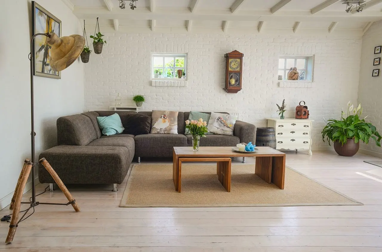
- Main color: the largest, most central surfaces, such as sofas, coffee tables and rugs (Livingetc).
- Secondary color: soft furnishings like curtains, bed linens and an accent chair, taking 30 percent (Livingetc).
- Accent color: smaller elements such as a lamp, cushions or artwork, taking 10 percent (Livingetc).
The rule exists to stop a scheme from fixating on a few cushions. It also gives you a way to spend a bold color sparingly while keeping the room calm around it.
Sources disagree slightly on where the main color goes. Homes & Gardens says the main color is usually seen on the largest space, the walls, and that the secondary color should get half as much space as the main one.
That fits designer David Harris’s advice, also reported by Homes & Gardens, that there is more wall than anything else in any scheme, so the wall color deserves the most thought. The Better Homes & Gardens Australia version lists walls, floors and large furniture together as the main block.
Choose the three colors with the color wheel
Knowing the ratio is not the same as knowing the colors. Better Homes & Gardens Australia suggests a color wheel and names three palette types you can test:
- Analogous: colors next to each other on the wheel, which gives a smooth, harmonious flow.
- Complementary: colors opposite each other on the wheel, which gives a high-contrast, dynamic result.
- Triad: three colors evenly spaced around the wheel, which offers more variety than analogous colors while staying balanced.
Pick the type that matches your mood note from earlier. Quiet rooms usually suit analogous neighbors, and lively rooms can handle the contrast of complementary pairs.
Per Homes & Gardens, the rule means using only three colors in any room, though you can bring in many tones of each. That limit helps most in open-plan spaces that are already busy.
How do you make rooms flow together?
A palette for the whole home needs a link between rooms. Livingetc quotes Molly Torres Portnof of DATE Interiors on two ways to do it: use the same trim color throughout the home, or put a color on the walls in one room and repeat it in a rug in the next.
Each room can still look and feel different. The repeated color is the thread that keeps the home from reading as separate experiments.
When the palette is settled, the next decision is layout, so read how to arrange furniture in a living room next.
Test the palette in your own light
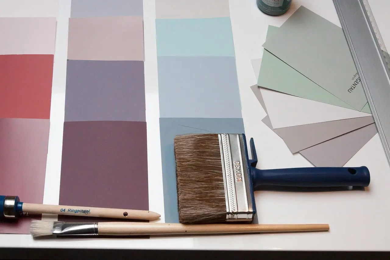
Paint chips lie under shop lighting. As Livingetc puts it, it’s important to test colors in person because the amount of natural light in your space is a big factor in what works best.
A simple routine makes the test reliable:
- Collect fabric samples and paint swatches for your main, secondary and accent colors.
- Lay them together in the actual room, next to your floor and largest furniture.
- Look at them in morning, afternoon and evening light before you commit.
- Drop any color that fights the others, then repeat with a replacement.
Compact rooms need the same checks, so read how to decorate a small bedroom alongside this guide.
Can you break the rules?
Yes, and the sources say so. Homes & Gardens calls the 60-30-10 rule simply a guideline for building color combinations, not a law.
Author Frida Ramsted goes one step further, according to Better Homes & Gardens Australia, and adds black and white to the formula: 60:30:10 plus black and white. Treat these variations as experiments once the basic balance feels natural.
Frequently asked questions
Does the rule work with neutrals only?
Show answer
Yes. Homes & Gardens shows a monochromatic room where white walls are the main color, grey cabinetry is the secondary color, and black check fabrics supply the accent.
Should my climate affect the palette?
Show answer
It can. Livingetc notes that in a predominantly hot climate you might use fewer warm hues and lean on cooler neutrals, while a cloudy, cool, rainy place can suit several layered warm hues for a cozy feeling.
Is there a single correct palette?
Show answer
No. Livingetc states there is no such thing as a “correct” palette, so the guidelines are there to support your confidence rather than replace your taste.