Not sure why a room feels off? Interior design basics come down to a few principles: balance, rhythm, emphasis, proportion and scale, and harmony. Learn them and you can make calmer, more confident choices in any room.
| Item | Value |
|---|---|
| Key principles in the Homes & Gardens guide | 5 principles |
| Types of balance named by Homes & Gardens | 3 types |
| Principles in the DesignFiles guide | 10 principles |
| Types of rhythm described by DesignFiles | 4 types (repetition, alternation, progression, transition) |
These figures come from Homes & Gardens and DesignFiles. Guides count and group principles differently and pages get updated, so check the source before you rely on them.
What the basics of interior design cover
Designers do not agree on one master list. Homes & Gardens walks through five key principles, while DesignFiles breaks down ten. IKEA Indonesia and Yanko Design each settle on seven.
The lists overlap heavily. Balance, harmony, rhythm, emphasis, and scale and proportion appear in all of them. IKEA Indonesia adds contrast and functionality, and Yanko Design adds detail.
Treat all of this as a set of guidelines. DesignFiles calls its principles helpful guidelines rather than rigid rules. Designer Sean Symington tells Homes & Gardens that rules in design are there to be bent, yet he still returns to the core principles to anchor a scheme.
In practice that means the principles are a checklist for judging a room, not a style you have to adopt. Use them to find out why a space feels flat, crowded or uneasy, then adjust one thing at a time.
Balance: how a room gets its calm
Balance is the distribution of visual weight, so no part of the room overpowers another. DesignFiles describes it as the careful distribution of visual weight in each space. If a room feels uncomfortable, Homes & Gardens suggests it could simply be off-balance.
The same guide names three types of balance, covered below.
Symmetrical balance
Symmetry mirrors one side of the room on the other, and it reads as calm and orderly. A bedroom with matching bedside tables and lamps is the textbook case, as Yanko Design notes. The same page warns that too much symmetry in modern design can leave a room without visual interest.
A small break is often enough to fix that. Homes & Gardens suggests a lamp in a different color or a cushion with a different pattern to add character to an otherwise matched layout.
Asymmetrical balance
Asymmetry uses different objects that carry a similar visual weight. A heavy, dark piece of furniture can weigh as much as several lighter pieces, according to DesignFiles. The result feels informal and lived-in rather than like a show home.
An alcove is a handy test case. Put a bold piece of art on one side and shelves of smaller objects on the other, and the two sides will not mirror each other but can still read as balanced, as Homes & Gardens explains. Be aware that Top4 says this approach is not always easy to achieve.
Radial balance
Radial balance organizes everything around a circular focal point, such as a round dining table with chairs gathered around it. Homes & Gardens gives another example: a large circular pendant light with curved sofas arranged beneath it. It is less common than the other two types, but it draws the eye inward.
Quick ways to test balance
- Spread heavy items, dark colors and strong textures around the room instead of stacking them on one side.
- Pair a large piece with a group of smaller items.
- Check height as well as width: DesignFiles suggests weighing tall shelves against low cabinets.
Rhythm, emphasis and harmony: guiding the eye
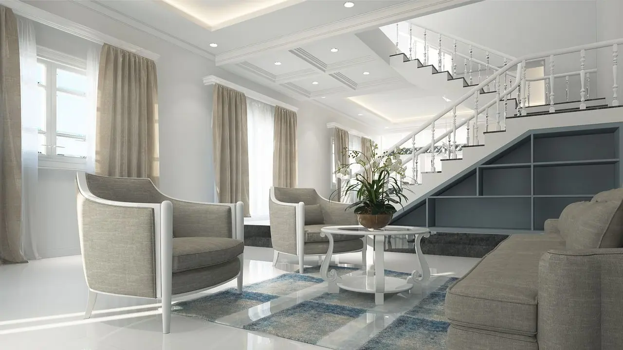
Once the weight is spread out, the next job is to give the eye somewhere to go. Rhythm is the visual beat of a room, and Homes & Gardens says you create it through repetition and predictability. Sometimes the building does it for you, with evenly spaced ceiling beams or the steps of a staircase.
DesignFiles lists the ways rhythm can work:
- Repetition: reusing the same color, pattern or shape throughout the room.
- Alternation: a pattern that switches between elements, such as striped wallpaper.
- Progression: a gradual change, such as artwork that grows in size.
- Transition: a smooth flow from one space to another.
A simple home version comes from Yanko Design: repeat a geometric pattern across a rug, throw pillows and artwork so the room feels connected.
Emphasis: pick a focal point
A room needs somewhere for the eye to land. Top4 lists a fireplace, a television, a window with a view, a staircase, artwork or a contrasting color as common focal points. That focal point should belong to the overall scheme without taking it over.
Avoid creating several focal points that compete, unless you mean to, as DesignFiles advises. Arrange the supporting furniture so it points toward the main feature rather than away from it.
Harmony: make it feel put together
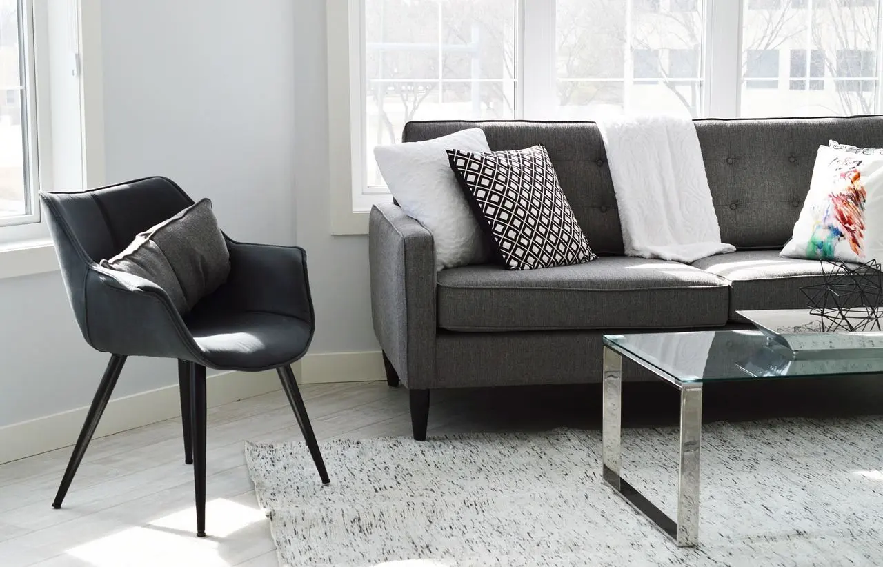
Harmony is what makes a space feel put together, according to DesignFiles. It can come from a cohesive color palette, a consistent furniture style or a single theme running through the home. Not every element has to match, and Yanko Design says pieces only need to complement each other, for example through a consistent color scheme or pattern.
Choosing the colors is where harmony usually starts. A walkthrough of how to choose a color palette for your home shows how to keep colors consistent from room to room.
Scale, proportion and contrast: getting sizes and differences right
These two terms are easy to mix up. Top4 defines scale as the size of one object compared with another, and proportion as the ratio of one design element to the whole. Both are about size, and both are why a piece can look wrong even when you like it.
Yanko Design offers a clear example: a tiny rug in a spacious living room can look disproportionate. A guide on how to choose a rug size helps you avoid that mistake. IKEA Indonesia adds that oversized furniture can dominate a room while pieces that are too small can feel out of place.
Plan on paper first
Top4 recommends scaled floor plans that show the furniture layout, the positions of windows and doors, power outlets and seating. Doing this before you buy is the cheapest way to check scale. It also makes the sentence-level advice in how to arrange furniture in a living room easier to follow.
Contrast and texture add life
Contrast adds depth by highlighting differences in color, shape, texture and material, says DesignFiles. A neutral base with bold contrasting accents is its simplest technique. IKEA Indonesia makes a similar point: contrast is what keeps a space from feeling monotonous.
Texture works the same way. Top4 notes that although texture is often not treated as a formal design element, it can add dimension to a space through furniture, furnishings and finishes.
How do you apply the basics room by room?
Start with how the room will be used. IKEA Indonesia says a well-designed space supports easy movement and efficient use, so layout and lighting come before decoration. Top4 also advises planning the spaces carefully so the home is both comfortable and practical.
A workable order of decisions looks like this:
- Decide what the room is for and sketch a scaled plan.
- Choose a focal point and point the main furniture toward it.
- Set a color palette that suits the whole home.
- Spread visual weight evenly, symmetrically or not.
- Repeat a few colors, shapes or patterns to create rhythm.
- Add contrast and texture, then check the scale of each piece.
Color, light and fabrics
Color has a strong influence on mood, says IKEA Indonesia, and Top4 adds that everyone reacts to it differently. Test a shade in the room before committing, using the steps for how to choose a paint color for a room.
Lighting also shapes mood, as IKEA Indonesia points out. The article on how to layer lighting in a room covers combining sources. For any new wiring or fixed fittings, follow the manufacturer’s instructions and use a qualified electrician.
Window dressing finishes the frame. The step-by-step on how to hang curtains correctly shows how to keep fabric in proportion with the window and wall.
Small rooms and shelves
IKEA Indonesia says that in limited spaces it is crucial to choose furniture designed for smaller rooms, and that modular furniture lets you adapt the layout to your needs. Put that into practice with how to decorate a small bedroom.
Shelves are a good place to practice emphasis, rhythm and balance on a small scale. The tips on how to style a bookshelf show how to group objects so the display feels deliberate.
Beyond the living spaces
The same habits of planning, repeating and editing carry outdoors. The guide to home gardening for beginners applies them to plants and outdoor spaces, and the home organization guide helps keep a finished room uncluttered. Your home should still reflect who you are, as IKEA Indonesia puts it.
Frequently asked questions
What are the basic principles of interior design?
Show answer
Most guides agree on a core group: balance, rhythm, emphasis, proportion and scale, and harmony. Longer lists, such as the one from DesignFiles, add ideas like functionality and visual flow. Pick the version that helps you most.
Do you have to follow every principle?
Show answer
No. Sean Symington tells Homes & Gardens that character is what makes a room feel personal, and that unexpected choices often make the most interesting spaces. The principles give a scheme its foundation, and personality goes on top.
Is symmetry or asymmetry better for a home?
Show answer
Neither wins every time. Symmetry feels calm and formal, while asymmetry feels relaxed but takes more judgment, since Top4 says it is not always easy to achieve. If you are unsure, begin with a symmetrical layout and add a few mismatched details.
Where should a beginner start?
Show answer
Begin with function and a scaled plan, because Top4 treats space planning as the groundwork for comfort. Next, choose a focal point and a color direction. Everything else can be layered in afterwards.